Landing Page Optimization for Google Ad Grants: How to Convert Free Traffic Into Real Impact
Your Google Ad Grant drives visitors to your website for free. But what happens after they click matters more than the click itself. If your landing page is slow, confusing, or mismatched to what the visitor expected, they'll leave, and your free advertising generates zero value.
Landing page quality matters even more for Grant accounts than for paid accounts, for two reasons. First, Grant ads typically appear below paid ads, so your visitors have already scrolled past other options to reach you. They chose your ad specifically. Don't waste that. Second, landing page experience is one of three factors in Quality Score, which directly affects your ad position, CPC, and whether your keywords stay active.
This guide covers how to match landing pages to search intent, optimize for conversion, and improve page quality for both visitors and Google's algorithms.
Key Takeaways - Never send all traffic to your homepage; match landing pages to keyword intent - Page speed matters: every additional second of load time reduces conversions - The CTA should be visible without scrolling - Landing page experience is 1/3 of your Quality Score - Each campaign (ideally each ad group) should have its own landing page
Rule #1: Match the Landing Page to the Search Intent
This is the most important and most frequently violated landing page principle. When someone searches for something specific and clicks your ad, they expect the landing page to address that specific thing.
| Search Query | Bad Landing Page | Good Landing Page |
|---|---|---|
| "volunteer opportunities [city]" | Homepage | Volunteer information and sign-up page |
| "donate to animal shelter" | Homepage | Donation page with shelter impact story |
| "free counseling [city]" | About Us page | Counseling services page with intake form |
| "summer camp registration [city]" | Programs overview | Summer camp specific page with registration |
| "food bank near me" | Mission statement page | Locations page with hours and directions |
The homepage trap: Nonprofits frequently send all Grant traffic to the homepage. This forces visitors to navigate to find what they searched for. Most won't bother. They'll leave.
The fix: Each campaign (ideally each ad group) should point to the most relevant page on your website. If that page doesn't exist, create it. A new landing page costs hours of effort; the Grant traffic it converts is worth thousands.
Rule #2: Make the CTA Visible Without Scrolling
The primary call-to-action (donate, sign up, register, contact) must be visible in the initial viewport before the visitor scrolls. This doesn't mean there should be nothing else above the fold, but the CTA should be clearly visible and accessible immediately.
What the above-the-fold area should include:
- A headline that confirms the visitor found what they searched for
- A brief (1-2 sentence) value proposition
- The primary CTA button
- Optional: one trust signal (rating, number of people served, years operating)
What it should NOT include:
- A full-screen hero image with no text
- A video that auto-plays
- A long organizational history
- Navigation menus that dominate the screen
Rule #3: Speed Is a Conversion Factor and Quality Score Factor
Google measures page speed as part of landing page experience (one-third of Quality Score). Slow pages also directly reduce conversions: every additional second of load time costs you visitors.
Target load times:
- Under 3 seconds for desktop
- Under 4 seconds for mobile
Quick speed wins:
- Compress images (use WebP format where possible)
- Enable browser caching
- Minimize JavaScript (especially third-party scripts)
- Use a CDN (Content Delivery Network)
- Remove unnecessary plugins (WordPress sites often have too many)
Test your speed: Use Google PageSpeed Insights to check your key landing pages. Address any "Opportunities" flagged in the results.
Rule #4: Mobile Optimization Is Non-Negotiable
Over 60% of Google searches happen on mobile devices. If your landing pages don't work well on mobile, you're losing the majority of your Grant traffic.
Mobile essentials:
- Text is readable without pinching to zoom
- CTA buttons are large enough to tap (minimum 44x44 pixels)
- Forms are easy to fill on mobile (large fields, auto-complete enabled)
- No horizontal scrolling
- Phone numbers are click-to-call
- Load time under 4 seconds on 4G connections
Rule #5: Build Trust Quickly
Nonprofit website visitors, especially first-time visitors from ads, need to trust your organization before they'll donate, sign up, or share personal information. Build trust within the first 5 seconds:
Trust signals that work:
- "Serving [city] since [year]"
- "[Number] families/animals/people helped"
- "Rated 4.8/5 on Google Reviews"
- Charity ratings and seals (GuideStar, Charity Navigator if applicable)
- Testimonials from beneficiaries or supporters
- Photos of real people, programs, and facilities (not stock photos)
- Clear privacy statement near forms ("Your information is confidential")
Optimizing by Page Type
Donation Pages
- Ask for the minimum information needed (name, email, amount, payment)
- Show suggested amounts with impact labels: "$25 feeds a family for a week"
- Default to a specific amount (not blank)
- Include a monthly giving toggle
- Show security badges near the payment form
- Remove navigation menus (reduce exit paths)
Volunteer Sign-Up Pages
- Describe what volunteers actually do (with photos)
- State time commitment clearly
- Mention "no experience needed" if true
- Keep the sign-up form short (name, email, availability)
- Show the number of current volunteers (social proof)
Program/Service Pages
- Lead with who the program is for and what it provides
- Include eligibility criteria (if any) early
- Provide hours, location, and contact information above the fold
- Include a clear next step: "Register online," "Walk in anytime," "Call us"
Educational Content Pages
- Answer the searcher's question in the first paragraph
- Include a soft CTA (email sign-up, related content) partway through
- Add a stronger CTA at the bottom (donate, volunteer, share)
- Link to related service pages and programs
The Landing Page Quality Score Connection
Google's Quality Score has three components: expected CTR, ad relevance, and landing page experience. Landing page experience evaluates:
- Relevance: Does the page content match the keyword and ad?
- Usefulness: Does the page provide what the searcher is looking for?
- Navigation: Is the page easy to navigate?
- Load speed: Does the page load quickly?
- Mobile-friendliness: Does the page work well on mobile devices?
- Trustworthiness: Does the page have clear contact information, privacy policy, and organizational details?
Improving landing page experience can lift Quality Score from 5 to 7, which improves ad position and reduces CPC. For Grant accounts where keywords with QS below 3 are auto-paused, landing page quality isn't just nice to have; it's a compliance factor.
Common Landing Page Mistakes
Sending everything to the homepage: Use specific landing pages for each campaign theme.
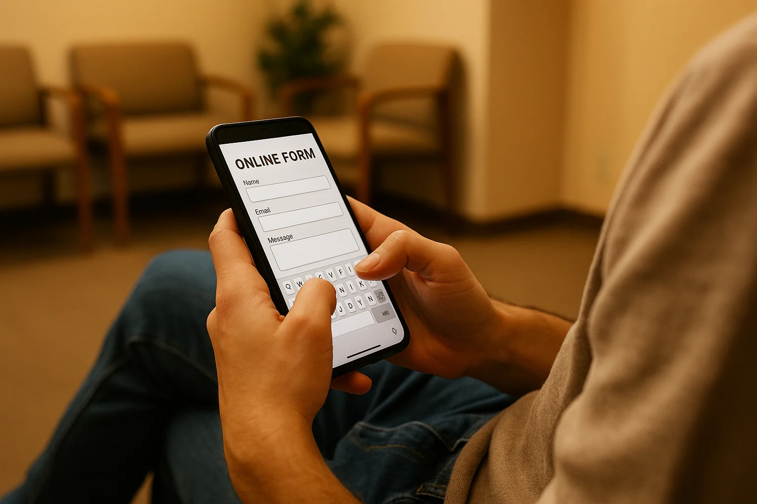
Forms with too many fields: Every additional field reduces completion rates. Ask only for what you absolutely need.
Missing mobile optimization: Test every landing page on an actual mobile device, not just a desktop browser resized.
No clear CTA: If the visitor has to search for the "Donate" or "Sign Up" button, you've lost them.
Outdated content: Landing pages referencing last year's events, old statistics, or discontinued programs erode trust.
Stock photos instead of real images: Visitors can tell the difference. Use photos of your actual programs, staff, and beneficiaries.
Improve Your Landing Pages with GrantMax
GrantMax evaluates the landing page experience for every keyword in your account and identifies pages that are hurting your Quality Score and conversion rates.
Prefer to hand it off to an expert? Our Google Ad Grant management services include landing page analysis and recommendations. Explore Grant Services
Frequently Asked Questions
How many landing pages do I need? At minimum, one for each campaign theme: donations, volunteering, each major program, and educational content. Ideally, one for each ad group. Most well-optimized Grant accounts have 10-20 distinct landing pages.
Should I create dedicated landing pages or use existing website pages? Use existing pages if they match the search intent well. Create dedicated pages only when existing pages don't serve the specific audience from a particular keyword group. Don't create landing pages that duplicate your site content; optimize the existing page instead.
Does landing page optimization differ by country? The principles are universal. Cultural expectations around form length, trust signals, and design preferences may vary. Always comply with local privacy laws regarding data collection on forms (GDPR consent for EU visitors, etc.).
Key Takeaways
- Match every landing page to search intent: never send all traffic to the homepage
- CTA visible without scrolling: above the fold, clear, specific
- Page speed: under 3 seconds desktop, under 4 seconds mobile
- Mobile optimization is non-negotiable: 60%+ of traffic is mobile
- Build trust in 5 seconds: years operating, people served, ratings, real photos
- Landing page experience = 1/3 of Quality Score: directly impacts ad performance
- Each campaign needs its own landing page (at minimum; ideally per ad group)
Published: March 2026 | Last Updated: March 2026 | Author: GrantMax Category: Optimizations | Tags: Advanced, Optimization