How to Build Nonprofit Landing Pages That Convert Google Ad Grant Traffic
Your Google Ad Grant gives your nonprofit up to $10,000 a month in free search advertising. That's thousands of people clicking through to your website every month without costing you a cent.
But here's the thing most nonprofits don't realize until they look at their data: the vast majority of those visitors leave without doing anything. They don't donate. They don't sign up. They don't volunteer. They land on your page, look around for a few seconds, and disappear.
The problem isn't your ads. It's where those ads send people.
A landing page is the specific web page someone arrives on after clicking your ad. And for Google Ad Grant accounts, landing pages matter more than they do for paid advertisers. Grant ads typically appear in lower positions than paid ads, which means the people who do click have already scrolled past competing results. They're genuinely interested. If your landing page loses them, you've wasted one of the most qualified visitors your website will ever get.
This guide walks you through exactly how to build landing pages that convert Google Ad Grant traffic into real outcomes: donations, volunteer sign-ups, email subscribers, event registrations, and program enrollments.
What you'll learn: The anatomy of a high-converting nonprofit landing page, the most common landing page mistakes that kill conversions, how to match landing pages to search intent, specific templates for different nonprofit goals, and how landing page quality directly affects your Quality Score and compliance.
Why Landing Pages Matter More for Grant Accounts
In a standard paid Google Ads account, advertisers can bid higher to secure top positions and use remarketing to bring visitors back. Grant accounts don't have either of those luxuries. Your ads appear below paid ads, and remarketing isn't available through the Grant.
That means every click has to count the first time. There's no second chance. If someone clicks your ad and your landing page doesn't immediately deliver what they expected, they're gone.
Landing page quality also directly impacts three critical aspects of your Grant account:
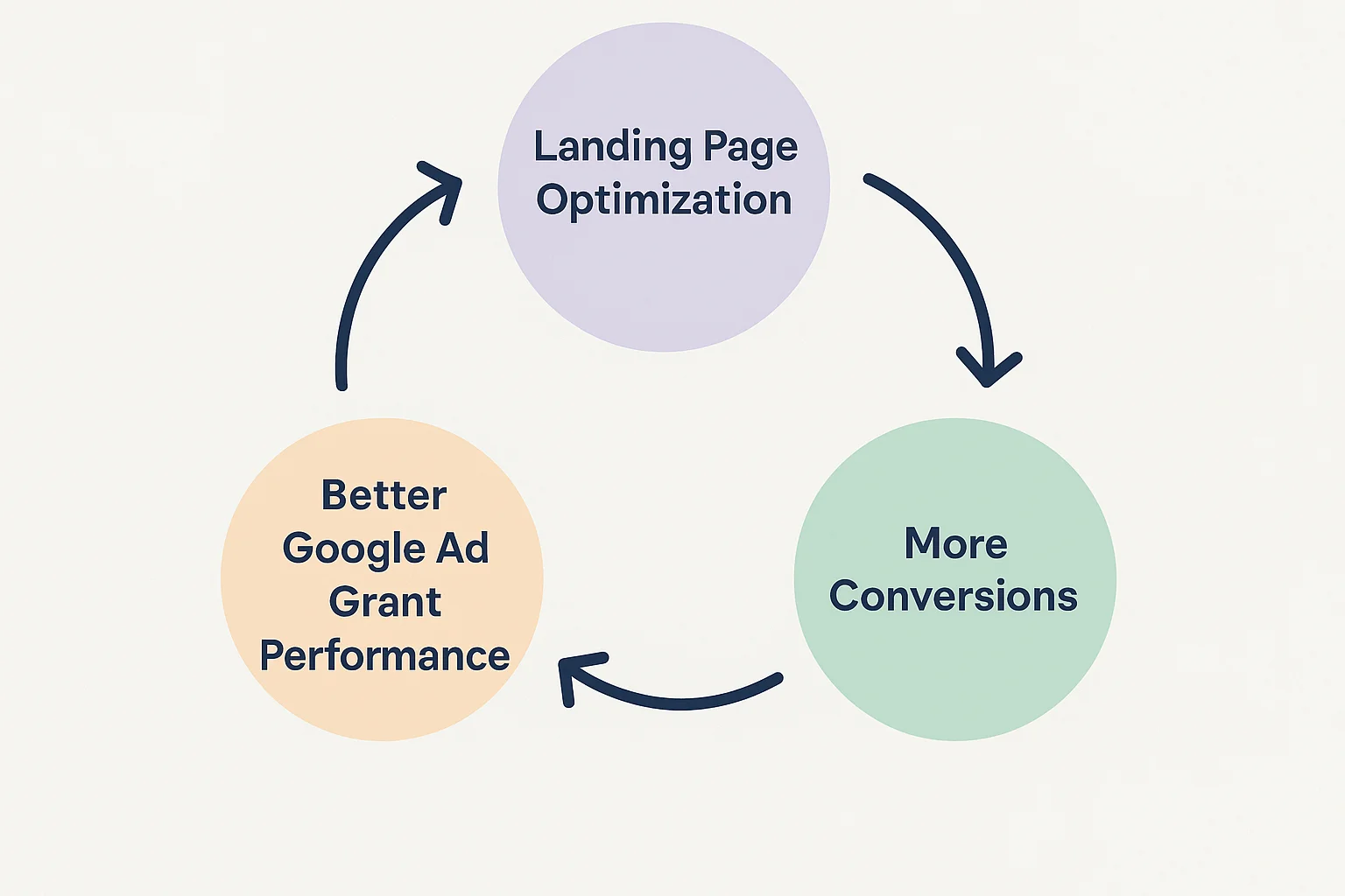
Quality Score. One of the three components of Quality Score is Landing Page Experience. If Google determines that your landing pages provide a poor experience (slow loading, irrelevant content, confusing layout), your Quality Score drops. Keywords with a Quality Score of 1 or 2 get auto-paused, and low Quality Scores across your account make it harder to win auctions and spend your full budget.
Conversion rates. Smart Bidding (which is required for Grant accounts) optimizes based on conversions. If your landing pages don't convert, Smart Bidding has no signal to optimize toward, and your campaigns underperform. Better landing pages mean more conversions, which gives Smart Bidding better data, which leads to even more conversions. It's a virtuous cycle.
Compliance. Google's website policy for Ad Grants requires that your site provides a good user experience, loads quickly on mobile, contains substantial original content, and includes a clear mission statement. Landing pages that violate these requirements can trigger account suspension.
The #1 Landing Page Mistake Nonprofits Make
Before we get into what works, let's address the single most common mistake: sending ad traffic to your homepage.
Your homepage is designed to serve everyone: first-time visitors, returning donors, board members, media, job seekers, and partner organizations. It has navigation to every part of your site, multiple messages, and multiple CTAs. It's a hub, not a destination.
When someone searches "volunteer at food bank near me" and clicks your ad, they want to land on a page about volunteering at your food bank. Not your homepage where they have to figure out where to click next. Every extra click you ask them to make loses roughly 20-30% of visitors.
The rule is simple: every ad group should point to a landing page that matches the specific intent behind those keywords. Not your homepage. Not your general "Get Involved" page. A specific page that delivers exactly what the searcher was looking for.
If you're running campaigns for donations, volunteering, event registration, and program enrollment, you need at least four distinct landing pages, and likely more for different segments within each goal.
The Anatomy of a High-Converting Nonprofit Landing Page
Every effective landing page, regardless of its goal, contains the same core elements. Here's the structure from top to bottom:
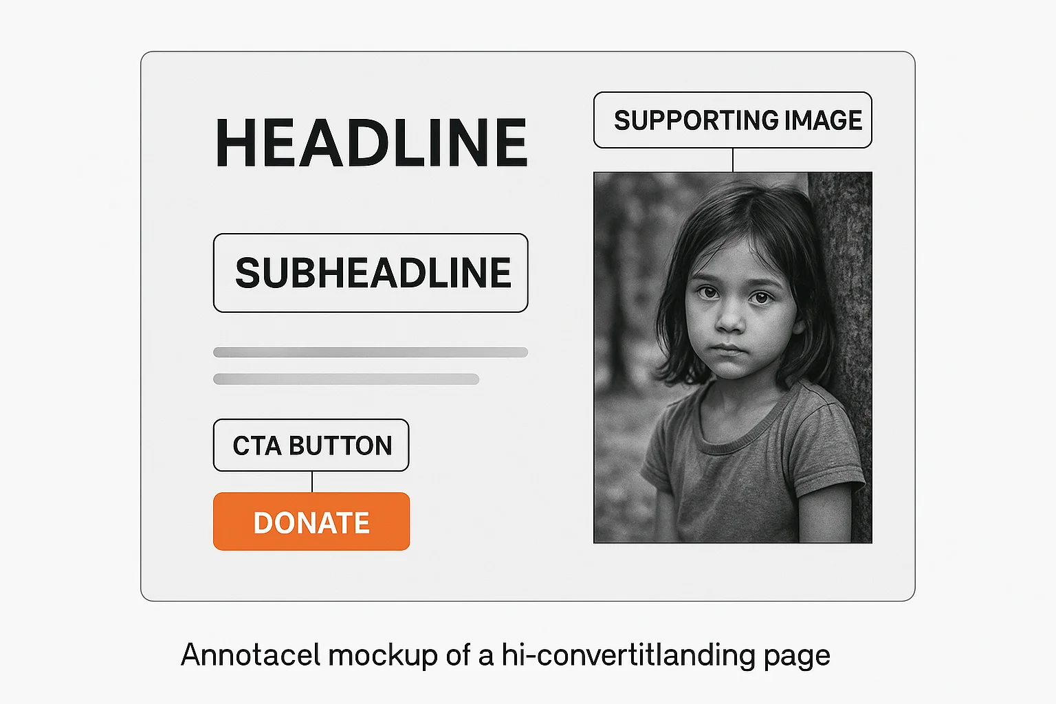
1. A Headline That Matches the Search Intent
Your headline is the first thing a visitor reads. It has approximately 3 seconds to confirm "yes, you're in the right place." If your ad targets the keyword "donate to animal rescue," your landing page headline should be something like "Help Us Rescue Animals in Need" rather than "Welcome to Our Organization."
Good headlines:
- "Help Feed 500 Families This Winter" (donation page)
- "Volunteer With Us: Make a Real Difference Every Saturday" (volunteer page)
- "Free After-School Program for Kids Ages 8-14" (program enrollment)
- "Join 2,000+ Supporters Fighting Homelessness in Portland" (email sign-up)
Bad headlines:
- "Welcome to [Organization Name]" (tells the visitor nothing about what they'll find)
- "About Us" (they didn't search for your life story)
- "Get Involved" (too vague; involved how?)
The headline should include or closely mirror the keywords from the ad group that's driving traffic to this page. This improves both user experience (the visitor feels the page matches their search) and Quality Score (Google sees relevance between keyword, ad, and landing page).
2. A Supporting Subheadline
One sentence below the headline that adds specificity. If the headline is emotional, the subheadline is practical. If the headline is practical, the subheadline is emotional.
Example:
- Headline: "Help Feed 500 Families This Winter"
- Subheadline: "Your donation provides a week of groceries for a family in crisis. 92% of every dollar goes directly to food."
The subheadline answers the visitor's next question: "What specifically will my action achieve?"
3. A Single, Clear Call to Action (CTA)
This is where most nonprofit landing pages fail. They offer too many choices: Donate, Volunteer, Learn More, Subscribe, Read Our Blog, Follow Us on Social Media. Each additional option reduces the likelihood that a visitor takes any action at all. This is known as the paradox of choice.
One page, one primary CTA. If the page is for donations, the CTA is "Donate Now." If it's for volunteer sign-ups, the CTA is "Sign Up to Volunteer." Everything else on the page supports that single action.
The CTA button should be:
- Visible without scrolling (above the fold on both desktop and mobile)
- Action-oriented language: "Donate $25 Today" is stronger than "Submit." "Join Our Volunteer Team" is stronger than "Sign Up"
- High contrast: The button color should stand out from the rest of the page
- Repeated: Place the CTA above the fold, once in the middle of the page, and once at the bottom. Visitors who scroll to the bottom are highly engaged and should find the CTA waiting for them
For more on writing effective CTAs, see our call-to-action guide.
4. Social Proof
People are more likely to take action when they see that others already have. Social proof elements include:
- Impact numbers: "12,000 meals served this year," "3,200 volunteers and counting"
- Testimonials: A quote from a donor, volunteer, or person served by your program. First name and photo increase credibility
- Trust badges: Charity Navigator rating, GuideStar seal, BBB accreditation, "501(c)(3) Tax Deductible" note
- Media mentions: "As seen in [Local News Outlet]"
Place social proof near the CTA. A testimonial directly above or beside the donation button can increase conversion rates by 15-30% based on what we've seen across nonprofit accounts.
5. Supporting Content (Below the Fold)
Not everyone converts immediately. Some visitors need more information before they're ready to act. Below the fold, include:
- The problem you're solving: 2-3 sentences about the need. Be specific: "1 in 6 children in our county goes to bed hungry" is more compelling than "many people need help."
- How their action helps: Connect the visitor's specific action to a tangible outcome. "$25 provides a week of groceries." "Two hours of your time gives a child a mentor for life."
- How it works: For volunteer pages and program enrollment, explain the process. "Step 1: Sign up. Step 2: Attend orientation. Step 3: Start making a difference." Reducing uncertainty reduces friction.
- FAQ: 2-3 common questions answered directly on the page. "Is my donation tax-deductible?" "Do I need experience to volunteer?" This addresses objections without forcing the visitor to navigate away.
6. Minimal Navigation
This is controversial, but effective: consider removing or minimizing your main navigation on landing pages. Your website's navigation bar gives visitors 8-12 places to click that aren't your CTA. On a landing page, the goal is to convert, not to explore.
At minimum, keep your logo (linking to your homepage) and remove or collapse the full navigation. This is standard practice in paid advertising and works equally well for Grant traffic.
If removing navigation feels too aggressive for your organization, at least ensure the CTA button is more visually prominent than any navigation link.
Landing Page Templates by Goal
Different campaign objectives require different page structures. Here are templates for the most common nonprofit goals:
Donation Landing Page
| Element | Details |
|---|---|
| Headline | Emotional, specific, impact-focused ("Help Us Build 50 Homes This Year") |
| Subheadline | What the donation achieves, with a specific number |
| CTA | Donation form or button with suggested amounts ($25, $50, $100, $250, Other) |
| Social proof | Number of donors, charity rating badges, donor testimonial |
| Below fold | Impact story, breakdown of how funds are used, FAQ (tax deductibility, recurring options) |
| Trust elements | SSL badge, "100% secure," 501(c)(3) EIN number |
Key tip: If your donation form is on a third-party platform (Classy, Donorbox, GiveWP), embed it directly on the landing page rather than linking out to it. Every redirect loses visitors. See our guide to tracking donations from Google Ads for integration details.
Volunteer Sign-Up Landing Page
| Element | Details |
|---|---|
| Headline | Specific role and impact ("Mentor a Teen: Change a Life in 2 Hours a Week") |
| Subheadline | What the volunteer experience involves |
| CTA | Simple sign-up form (name, email, phone, availability) or "Sign Up to Volunteer" button |
| Social proof | Number of active volunteers, volunteer testimonial with photo |
| Below fold | What to expect (orientation, time commitment, location), FAQ (requirements, background check, training) |
| Trust elements | Volunteer photos (with permission), organization accreditation |
Key tip: Keep the initial sign-up form as short as possible. Name, email, and one question about their interest is enough. You can gather more details in a follow-up email. Every additional form field reduces completions by approximately 10%.
Event Registration Landing Page
| Element | Details |
|---|---|
| Headline | Event name, date, and value proposition ("Annual Gala: An Evening for Education, March 15") |
| Subheadline | What attendees will experience |
| CTA | "Register Now" or "Reserve Your Spot" with ticket options |
| Social proof | Past event photos, attendance numbers, speaker/entertainment names |
| Below fold | Agenda/schedule, venue details, parking/transport info, FAQ (dress code, dietary options, refund policy) |
| Trust elements | Past sponsor logos, media coverage of previous events |
Key tip: Create urgency without being dishonest. "Early bird pricing ends March 1" or "Only 50 seats remaining" works if it's true. For more on event promotion through your Grant, see our event promotion guide.
Email Newsletter Sign-Up Landing Page
| Element | Details |
|---|---|
| Headline | What the subscriber gets ("Monthly insights on [cause]: research, stories, and ways to help") |
| Subheadline | Frequency and value ("Join 5,000+ supporters. One email a month. No spam, ever.") |
| CTA | Email field + "Subscribe" button. Nothing else. |
| Social proof | Subscriber count, sample newsletter preview |
| Below fold | What topics the newsletter covers, sample article headlines, privacy assurance |
| Trust elements | "Unsubscribe anytime," privacy policy link |
Key tip: Using your Grant to build an email list is one of the highest-ROI strategies available. Email generates $36-44 per dollar spent. A Grant-driven email subscriber costs you nothing to acquire and can generate value for years.
Program Enrollment Landing Page
| Element | Details |
|---|---|
| Headline | Program name and primary benefit ("Free Job Training for Veterans: New Careers Start Here") |
| Subheadline | Who it's for and what they'll get |
| CTA | "Apply Now" or "Enroll Today" with a simple intake form |
| Social proof | Program completion stats, alumni testimonial, employment rate |
| Below fold | Program details (curriculum, schedule, location, duration), eligibility requirements, FAQ |
| Trust elements | Partner/funder logos, accreditation, success rate statistics |
How to Match Landing Pages to Search Intent
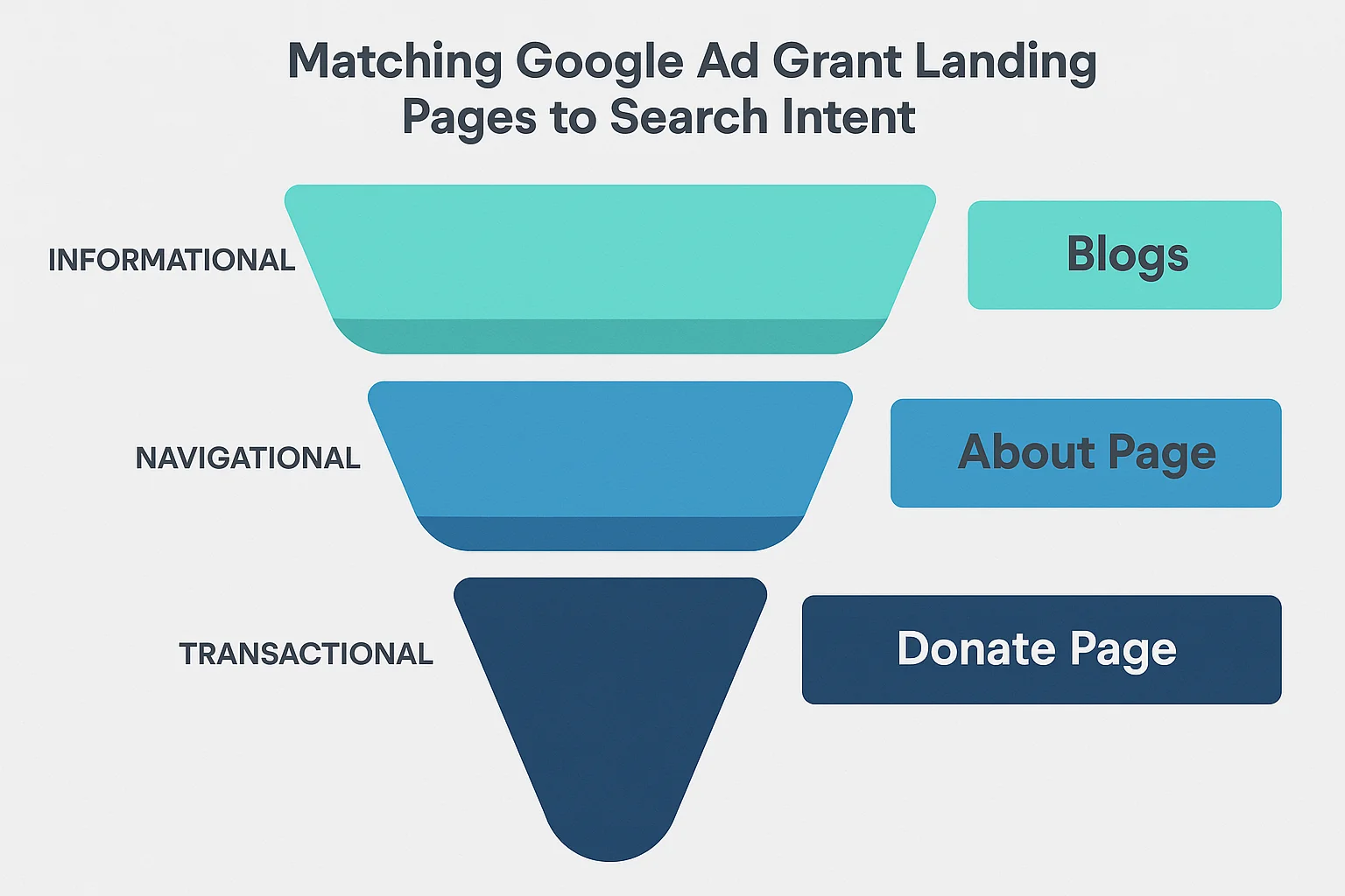
Not all search queries are created equal. The person searching "what is a food bank" is in a very different mental state than the person searching "donate to food bank near me." Your landing pages need to match where the searcher is in their journey.
Informational intent ("what is," "how does," "learn about"): These searchers are learning, not ready to act. Send them to educational content (blog posts, resource pages) with a soft CTA like "Subscribe for more" or "Learn how you can help." Don't send informational searchers to a donation page; they'll bounce. This is where your Resource Centre articles shine.
Consideration intent ("best way to help," "volunteer opportunities near me," "organizations that help"): These searchers are comparing options. Send them to pages that explain your approach, show your impact, and differentiate you from alternatives. Include both information and a clear CTA.
Action intent ("donate to," "sign up for," "register for," "apply to"): These searchers are ready to act right now. Send them directly to the conversion page (donation form, volunteer sign-up, registration). Minimize friction. Don't make them read paragraphs of content before they find the form.
Your keyword strategy should include landing page assignments for every ad group, with each page matching the dominant intent behind those keywords.
Mobile Optimization: Non-Negotiable
Over 60% of Google searches happen on mobile devices. For nonprofit-related searches, the mobile percentage can be even higher because many people search for help, services, and support resources on their phones.
Your landing pages must work flawlessly on mobile. This means:
Fast loading. Google recommends pages load in under 3 seconds on mobile. Test every landing page with Google's PageSpeed Insights tool. Common speed killers: uncompressed images, too many scripts, slow hosting, and embedded videos that auto-load.
Thumb-friendly CTAs. Buttons must be large enough to tap easily (at least 44x44 pixels) and have enough space around them so visitors don't accidentally tap the wrong thing.
No horizontal scrolling. Your page must fit within the mobile viewport. Tables, wide images, and fixed-width elements that force horizontal scrolling will lose visitors instantly.
Readable text without zooming. Body text should be at least 16px on mobile. If visitors have to pinch-to-zoom to read your content, they won't.
Forms that work on mobile. If your CTA involves a form (donation, sign-up, registration), test it on an actual phone. Dropdown menus, date pickers, and multi-field forms that work fine on desktop can be painful on mobile. Use appropriate input types (email keyboard for email fields, number pad for phone fields).
Mobile experience is part of Google's website policy for Grant accounts. A poor mobile experience can affect both your Quality Score and your compliance status.
Common Landing Page Mistakes That Kill Conversions
Here are the most frequent problems we see when auditing nonprofit Grant accounts:
Sending all traffic to the homepage. We've covered this, but it bears repeating: it's the most common mistake and the most impactful to fix.
Too many CTAs. "Donate, Volunteer, Subscribe, Follow Us, Read Our Blog, Watch This Video, Share on Facebook" all on one page. Pick one primary action per page.
Walls of text. Nobody reads a 2,000-word essay on a landing page. Break content into scannable sections with headers, bullet points, bold key phrases, and plenty of white space.
No trust indicators. If you're asking for money, visitors need to trust you. Charity ratings, security badges, EIN numbers, and testimonials aren't optional on donation pages.
Slow page load. Every additional second of load time reduces conversions by roughly 7%. A page that takes 6 seconds to load has already lost over 20% of potential conversions before anyone even sees your content.
Generic stock photos. A stock photo of smiling people in a meeting tells the visitor nothing about your organization. Use real photos of your team, your community, and your impact. Authenticity converts.
Broken donation links. Google's website policy specifically requires working donation links. A broken "Donate" button doesn't just lose revenue; it can trigger a compliance review. Test your donation links monthly.
No conversion tracking. If you can't measure whether your landing pages are converting, you can't improve them. Set up GA4 conversion tracking for every landing page CTA. Track form submissions, button clicks, and donation completions as meaningful conversions.
How to Test and Improve Your Landing Pages
Building the initial landing page is step one. Continuous improvement is what separates nonprofits that spend $300 a month from those that spend $10,000.
Set Up Baseline Metrics
Before making changes, know where you stand. In GA4, look at:
- Engagement rate for each landing page (percentage of visitors who stayed more than 10 seconds or took an action)
- Conversion rate for each landing page (percentage of visitors who completed the desired action)
- Bounce rate (percentage who left without interacting)
- Average engagement time (how long visitors spend on the page)
Run A/B Tests
Change one element at a time and measure the impact:
- Headlines: Test emotional vs. practical, specific numbers vs. general claims
- CTA text: "Donate Now" vs. "Give $25 Today" vs. "Help Feed a Family"
- CTA placement: Above the fold only vs. repeated throughout the page
- Social proof: Testimonial vs. impact numbers vs. charity rating badge
- Images: Photo of people served vs. volunteers in action vs. no image
- Form length: 3 fields vs. 5 fields vs. 7 fields
Google Ads has built-in A/B testing capabilities through campaign experiments, but even simple before-and-after testing (change the page, compare this month's conversion rate to last month's) is better than never testing at all.
Review Search Terms
Your Search Terms report shows you exactly what people typed before clicking your ad. If you notice a pattern of searches that don't match your landing page (for example, people searching for "volunteer dog shelter" but landing on a general "Ways to Help" page), create a more specific landing page for that intent.
Landing Page Quality and Your Compliance Score
Landing pages aren't just about conversions; they directly affect whether your Grant stays active. Google's compliance requirements include several website-specific rules:
- Substantial original content: Your landing pages need real, useful content, not just a form. Include at least 200-300 words of mission-relevant content on each page
- HTTPS: Every landing page must load over HTTPS. No exceptions
- No AdSense: Your landing pages cannot display Google AdSense ads
- Working donation links: If your page has a donate button, it must work
- Mobile-friendly: Pages must render properly on mobile devices
- Mission statement: Your website must include a clear mission statement (this can be on any page, not necessarily every landing page)
- Fast loading: While there's no specific speed threshold, excessively slow pages can trigger a website policy review
GrantMax checks all of these requirements automatically and flags any compliance issues related to your website. If you're unsure whether your landing pages meet Google's standards, run a free audit to find out.
A Quick-Start Checklist for Your Next Landing Page
If you're building a new landing page for a Grant campaign, use this checklist:
- [ ] Headline matches the primary keyword/intent of the ad group pointing to this page
- [ ] Subheadline adds specificity (numbers, outcomes, timeframe)
- [ ] One clear, primary CTA visible above the fold
- [ ] CTA button repeated at least once below the fold
- [ ] CTA uses action-oriented language specific to the desired outcome
- [ ] At least one social proof element near the CTA (testimonial, impact number, trust badge)
- [ ] Page loads in under 3 seconds on mobile (test with PageSpeed Insights)
- [ ] Page works on mobile without horizontal scrolling, pinch-to-zoom, or broken forms
- [ ] At least 200-300 words of original, mission-relevant content
- [ ] HTTPS enabled
- [ ] No AdSense ads on the page
- [ ] Donation links tested and working (if applicable)
- [ ] Conversion tracking set up for the primary CTA
- [ ] Navigation minimized or removed
Audit Your Landing Pages with GrantMax
Not sure if your landing pages are helping or hurting your Grant? GrantMax's AI-powered analysis evaluates your landing pages against Google's compliance requirements and scores their quality. You'll see exactly which pages need attention and get specific, actionable recommendations to improve both compliance and conversion performance.
Frequently Asked Questions
Should I create separate landing pages or use existing website pages? Both can work. If you have strong existing pages that match specific search intent (a well-built volunteer page, a clear donation page), use them. But if your existing pages are general-purpose (an "About Us" page, a homepage), create dedicated landing pages for your Grant campaigns. The key is intent match: does the page deliver exactly what the searcher was looking for?
How many landing pages do I need for my Grant account? At minimum, one per campaign objective. If you're running campaigns for donations, volunteering, and event promotion, you need at least three landing pages. Ideally, each ad group points to its own landing page. For a typical Grant account with 5-10 ad groups, that means 5-10 dedicated pages.
Do landing pages affect my Quality Score? Yes. Landing Page Experience is one of three components of Quality Score, alongside Expected CTR and Ad Relevance. A poor landing page experience can drag your Quality Score down to 1-2, which triggers auto-pausing of those keywords.
Can I use a third-party platform (Classy, Donorbox) as my landing page? No. Google's Ad Grants policy requires that your ads point to a domain you own. You cannot use a third-party donation platform URL as your ad destination. Instead, embed the donation form on a page within your own website domain.
What's a good conversion rate for a nonprofit landing page? It varies by goal. Donation pages typically see 2-5% conversion rates. Email sign-up pages can achieve 10-25%. Volunteer sign-up pages usually fall between 5-15%. Event registration pages average 3-10%. If your conversion rates are below these ranges, there's room for improvement. See our benchmarks guide for more detail.
Key Takeaways
- Never send Grant traffic to your homepage; use dedicated landing pages matched to search intent
- Every landing page needs one clear, primary CTA visible above the fold
- Landing Page Experience directly affects your Quality Score, which affects your budget and compliance
- Mobile optimization is non-negotiable; over 60% of nonprofit searches happen on phones
- Test and iterate: small improvements compound over time
- Social proof near the CTA (testimonials, impact numbers, trust badges) increases conversions significantly
- Set up conversion tracking before launching any campaign; you can't improve what you can't measure
- GrantMax audits your landing pages automatically and flags compliance issues
Published: April 2026 | Last Updated: April 2026 | Author: GrantMax Category: Optimizations | Tags: Optimizations, Strategy, Website, Conversion Tracking